My issues with Tesla's new truck

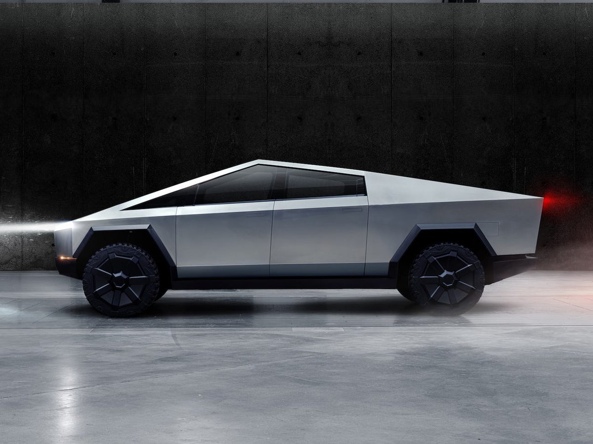
Elon Musk recently revealed Tesla’s newest production model, a truck, that many have been anticipating for a while now. Loving pretty much all of the other four current Tesla models—the S, 3, X, and Y— I was excited to see what Tesla would do with a truck. However, that excitement quickly diminished when the truck rolled out onto the stage and all I saw was a door wedge on wheels.
Okay, that’s a little harsh, but I was absolutely disappointed in the design of this new Tesla, named the Cybertruck. I would like to preface this argument with the fact that I am a Mechanical Engineering and Design, Innovation, and Society dual major, so I do have some design knowledge and experience to back up my opinions and criticisms of the Cybertruck.
I had very stark opinions at first: the design was awful. I thought it looked like a joke with its incredibly angular and simple shape. I was not alone, proven by the online meme where it compares Tesla’s truck to a low-poly version of a vehicle in the first HALO game from 2001. Even the official LEGO twitter account got in on the fun. The design of the Tesla Cybertruck is subpar, but I will admit it does a couple things right.
I’ll start with the bad news first so I don’t have to end on a pessimistic note. To start with the exterior design of the car, most of what I have to say is personal opinion with little concrete supporting evidence, but it is still relevant. I simply detest the shape of the Cybertruck, it just looks silly. It’s weird that I dislike this so much because I totally love boxy, angular designs like the Toyota MR2, the Volkswagen Thing, and I drive a 1996 Volvo 850 myself an arguably angular design. But nothing in the Cybertruck’s exterior works for me. I think what puts me off the most is all the awkward angles and long, straight edges. It basically lives by the mantra that the shortest distance between two points is a line. The corners are so sharp it feels like I could cut myself just by looking at it, which I wouldn’t want when buying a car.
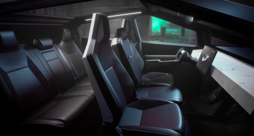
The uncanny sharpness travels into the interior of the car as well with the geometric seats and dashboard. The first time I saw the dashboard I thought it was a slab of marble, and so did my friend when I showed it to him. None of the interior seems inviting or welcoming to sit on for the 500 plus mile range that the most expensive Cybertruck model boasts.

I would say the biggest offending design in the interior of the Cybertruck is the steering wheel, or lack thereof. As of now, the design for the Cybertruck’s steering wheel is closer to an airplane than a car. I can easily see this new steering wheel design being very problematic for drivers that use the entire steering wheel when driving, like in the popular hand-over-hand technique that I use myself. This change in steering wheel could be a difficult interruption of traditional driving methods that most, if not all, drivers use. This steering wheel design works on airplanes because the pilot does not need to turn the steering in multiple full rotations like a driver does in a car. In a car, it could even prove dangerous if there were only two places to grab onto the steering wheel when making a sharp turn or other maneuver that requires multiple full rotations of the wheel.
What is the intended purpose of this truck? It has 3 millimeter thick body panels and armored glass that Tesla claims are bulletproof up to 9 millimeter rounds. But why are these armored aspects necessary for a civilian truck? Each door is 60 pounds, a little ridiculous to open and close on a day-to-day basis. With all of this in mind, I don’t believe this truck was designed for traditional truck users. It was designed for people who are already fans of Tesla and want to stand out from other people with their new pentagon on wheels. By alienating actual truck users with this design, it goes against Tesla’s mission statement “to accelerate the world’s transition to sustainable energy.”
Now for the good news. One of the biggest things I believe the Cybertruck does right isn’t necessarily in the physical design of it, but the intention of it—to shake up the current norm of car design. I absolutely agree with Elon Musk that car design has stagnated and most modern cars are indistinguishable from each other; everything just blurs together. The Cybertruck is a great step forward and will hopefully influence other automobile companies to take risks with their car design. It received over 250,000 pre orders in only five days after its release, and I’m sure that number has increased even more by the time I am writing this.
Another part of current automotive design that the Cybertruck challenges is the traditional body-on-frame construction of cars and trucks specifically. This construction method is when a general frame of the car is made with the engine and wheels attached, and then all the body panels and interior are built separately and later laid on top of this frame. However, the Cybertruck uses a new method that combines the body and frame into a sort of exoskeleton. I am not entirely sure how I feel about exoskeleton cars like the Cybertruck. Although this method does allow for a car that is stronger overall, such strength is a double-edged sword. It may sound odd, but cars are designed to handle a crash and one of the key components of current crash protection are crumple zones that slow down the rapid deceleration that happens during a collision. I don’t know how strong the exoskeleton makes a car, but I can’t imagine it offers very much of a crumple zone in a crash, meaning all that force is going to go straight inside and then into the passengers.
The final part of the Cybertruck’s design that I want to talk about is something that I think is brilliant; the singular headlight across the front of the car. I have no idea why no other car has not done this before. LED technology has been around for almost 60 years now, and the current setup for headlights just doesn’t make sense anymore. Having two lights on either side gives two cones of light that results in uneven lighting of the road in front, which could be dangerous. With the Cybertruck’s singular headlight, the road is evenly and sufficiently lit up so the driver can see at night. It is so simple, yet so ingenious.
Even after writing this piece and being forced to watch more videos and reconsider my opinion multiple times, I still don’t like the Cybertruck’s design. I like that it challenges car design norms, but I feel that it is too challenging to be appealing or an effective design for today's world.

 Opinion
 Editorial Notebook
 FOOTBALL
 Off-Campus Event