 STUDENTS AND ALUMNI HAVE COMPLAINED about the new Renselaer Union logo, bottom, especially the arches and font of the new design. Union Communications Specialist Holly Nelson guided students in designing the logo.
Editor’s note: In our print edition, the caption for the graphic is incorrect. Communications Specialist Holly Nelson did not design the new Union logo. The designs were completed by student designers, as stated in paragraph four of the article.
A new Rensselaer Union logo, designed throughout first and the beginning of second semester and approved by the Union Executive Board on March 25, has been met with sharp criticism across campus. Though focus groups were involved in refining the design, many students and alumni have voiced negative feeling towards the final product.
Union Communications Specialist Holly Nelson, who started working at RPI in the fall, said her position revolves around the logo and the image of the Union.
“It’s part of what I’m evaluated on,” said Nelson. “[The concept of a new logo] was discussed at my interview.”
The initial design, explained Nelson, was created throughout the first semester. Student designers researched other schools’ designs and worked on, edited, and brought to the table what they thought would be good for the Union. Focus groups, however, disagreed with the first iterations, as none of the included the Union’s characteristic arches.
After going back to the drawing board and incorporating arches, a second set of logos were displayed. After some more feedback, the designs were once again refined, and four variations were brought to the Marketing, Advertising, and Publicity Committee. MAP also provided some feedback, causing a few more alterations, which the designers and MAP then brought to the Executive Board. After approval, the logo was made public during Grand Marshal Week 2014.
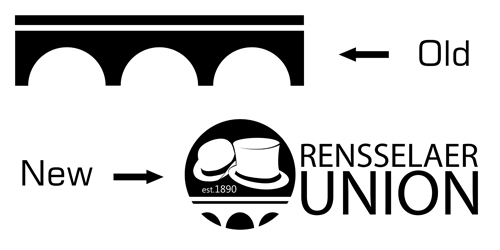
A post on Facebook by the Union presented the logo, with some history alongside it. The previous logo, released on October 21, 1967, is meant to be honored in the new one, as are the Grand Marshal’s top hat and the President of the Union’s derby—showing that the Union is a student-run organization.
The response from the Rensselaer community has been mixed at best though, leading to detailed discussion on design choices and how necessary the change was on social media like Facebook and Reddit.
Kyle Mackenzie ’12 was the first to give input on Facebook, saying it was “poor, at best.” He wrote about it being overly complicated, having no central focus, and it not being distinct. He also touched on typography and font choice, saying the “est. 1890” is particularly “hideous.” His comments were deleted, although they’ve since been replaced. While a majority of the published feedback was in the negative, Kate Marciano ’14 pointed out that the post by the Union’s Facebook page did gain many likes, calling for “those with opinions on this change, especially positive ones … to come join the discussion on /r/rpi.” Marciano was of course referring to Reddit, where a majority of the detailed discussion took place.
Concerns raised by various commenters focused on design choices like the font choice and the shape of the arches. The font, Myriad Pro Regular, which users called “overused and cliché” is the default of Adobe’s Creative Suite, the package used to design the logo. Myriad has also been used by Apple for almost everything they did before iOS 7 was released—when they switched to Helvetica Neue—but Reddit users seem to agree that the Union is not the place for the typeface. In terms of the incorporation of the arches themselves, students voiced disagreement with the shape of the arches, pointing out that the logo misrepresents the building because, “the Union does not have elliptical arches.” A final major complaint dealt with the emphasis of the Grand Marshal’s top hat and the President of the Union’s derby with one commenter stating, “It’s almost as if the student representatives are above the Union itself. Our representatives should support the entire student body and their interests.” Other users commented on the design as a whole calling it, “(a) graphics standards nightmare,” and calling the evolution from the previous design, “change for the sake of change.”
Nelson addressed some of the various concerns such as the font choice and the use of the top hat and derby. She stated that many different fonts were presented to the various groups who assisted in the decision process and the one chosen was the most liked. In regards to the use of representative hats, Nelson said that hypothetically, if the logo was to be widely adopted, the hats in the circular part of the logo could be changed out to reflect specific branches of the Union or specific organizations within the Union. Examples include a gavel for the Judicial Board, or a box and a checkmark for the Rules and Elections Committee, similar to how the past logo was modified.
The approved logo has been on t-shirts and the aforementioned stickers, and it has also been used on graphics the Union has published on Twitter and Facebook. It has yet to be incorporated into the Union website, and the logos section of the site still includes the old arch-type logos of all organizations. As the logo is implemented across the Union, its reception could change, though that is yet to be seen.